British car manufacturer Jaguar has been warned of "commercial suicide" after rebranding their logo and releasing a bold new television advert.
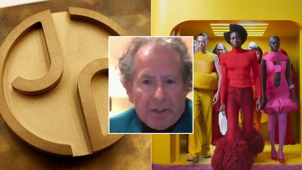
The luxury vehicle maker, founded in 1922, has swapped their iconic jaguar logo for a curved geometric J badge, removing any depiction of the animal the brand is based on.
In defence of their rebrand, Jaguar said in a statement that the vision for their new image is built around "Exuberant Modernism".
However, motoring author and co-founder of the International XK Jaguar Club, Philip Porter said the rebrand comes across as a "bad joke", warning the company of "commercial suicide".
Philip Porter has warned Jaguar of 'commercial suicide' following their rebrand
Jaguar / GB News
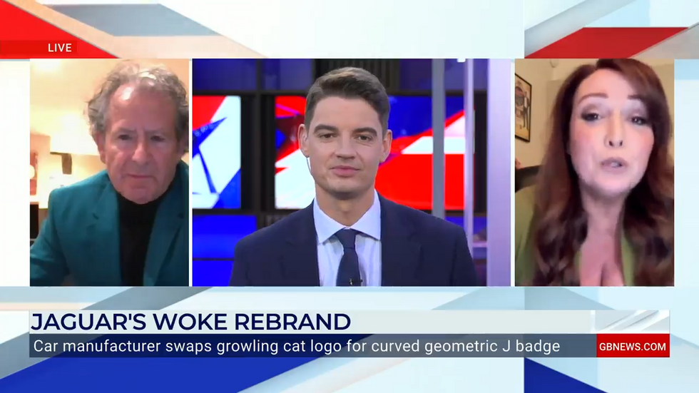
Porter told GB News: "I think it's commercial suicide. I think it's a bad joke, it's hilarious.
"I think it's just absolutely crazy. There's always been a passion about Jaguar, and this logo is is just ridiculous, isn't it? It takes a long time to build a brand, but you can crash it overnight."
In defence of Jaguar, commentator Amy Anzel said the new advert is "fantastic" and "thrilling".
Anzel explained: "I think it's fantastic. I think that ad is thrilling and exciting and like a coming attraction as to what's to come. If I want to describe it, it's definitely bold and artistic and imaginative.
When asked by host Ben Leo what the thought might be for the rebrand, Porter claimed that the manufacturer has "put all its eggs in one basket", but it is an "ill thought out strategy".
Porter stated: "The world is going crazy thinking electric cars and electric vehicles are the answer, and they feel they've got to do this, but they're putting all their eggs in one basket. They're going totally electric.
"That is out of kilter with people like Toyota, etc. who are having second thoughts. It's not necessarily the answer, and I think it's a crazy, very short term, ill thought out strategy."
In disagreement with Porter, Anzel argued that the brand is looking to the future and teasing the audience with "what's to come".
Amy Anzel defended the rebrand, claiming it is 'fantastic'
GB News
Please write at least 2 paragraphs
Anzel told GB News: "I think it's more like a thrilling, exciting, modern slant. Obviously the Jaguar logo has been rebranded and I think they're telling you here's what's to come - it's storytelling, it's emotive.
"They don't want to be ordinary, they want to live vivid, they want to copy nothing, they want to break moulds - that's the point of that sledgehammer. I think it's an exciting time. The world is moving forward - it's a 90 year old company, they need to keep up with the times, but there's always going to be a legacy."
JLR's chief creative officer Gerry McGovern said: "Jaguar has its roots in originality. Sir William Lyons, our founder, believed that 'a Jaguar should be a copy of nothing'.
"Our vision for Jaguar today is informed by this philosophy. New Jaguar is a brand built around Exuberant Modernism. It is imaginative, bold and artistic at every touchpoint. It is unique and fearless.
"We are creating Jaguar for the future, restoring its status as a brand that enriches the lives of our clients and the Jaguar community."

 By GB News (World News) | Created at 2024-11-21 16:11:28 | Updated at 2024-11-21 21:08:17
5 hours ago


